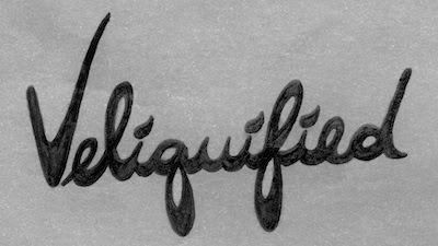
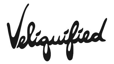
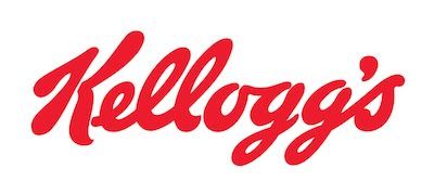
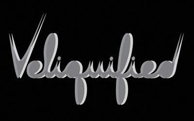
so i took some time out to revamp the veliquified logo. someone told me once the other looked very similar to the kellogg's logo, but i planned to eventually work on it again anyway because i wasn't completely satisfied with it. i'm happier with new veliquified logo, i don't know if i'm totally sold yet, and i'll probably come back to it and re-work it again... but for now... i like it :)
the old ones:
i used this one for blogspot

this one was used here

this is the kellogg's logo so you can see the similarity between them

and the new one:

TELL ME WHAT YOU THINK please :)

No comments:
Post a Comment